Getting Visitors but No Customers? Fix the Gaps With Conversion Optimization
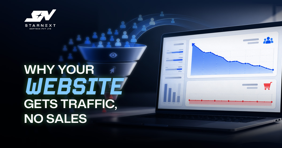
A busy analytics dashboard can create a sense of progress. Sessions are rising, rankings look healthier, ads are generating clicks: Sales, enquiries or bookings barely move. At that point buying traffic is often the most expensive way to avoid the real problem.
Traffic creates an opportunity; it does not create a customer. A visitor needs to recognise that the page solves their problem, believe the business can deliver and see a next step that feels worth taking. If one of those pieces is missing, even a trafficked site can feel like a shop with plenty of people walking in and nobody approaching the counter.
That is the purpose of Conversion Rate Optimization: finding where interested people hesitate to lose confidence or abandon the journey then removing the obstacle with evidence instead of opinion.
Traffic is not the problem until you prove it is
Before changing a headline or rebuilding a landing page ask a basic question: are you attracting people with a realistic chance of becoming customers? Not all traffic should be expected to convert at the rate.
A guide on choosing a trainer may bring in readers who are still researching. A page targeting " trainer near me" usually attracts a different visitor:someone comparing options, checking prices and deciding whether to make contact. Both pages can be valuable. Judging them by one lead target creates bad decisions.
Measure the actions that produce business value
For a service business a completed quote request may be only the start of the sale. For a store an order matters, but so do profit margin, returns and repeat purchases. Good conversion measurement follows the customer journey rather than stopping at the first button click.
- Primary conversions should reflect commercial progress: completed purchases, qualified leads, booked appointments or calls that meet a meaningful duration threshold.
- Supporting actions such as product views, quote-form starts, add-to-cart events and brochure downloads help diagnose where intent is building or disappearing.
- Quality measures such as lead-to-sale rate, average order value, refund rate and repeat purchase rate prevent a business from chasing unprofitable conversions.
What conversion rate optimization actually changes
What is conversion rate optimization in terms? It is a way to improve the share and value of meaningful actions generated from existing traffic. It draws on analytics, user research, page design, copy offer strategy and testing, It is not limited to any one of them.
Many teams reduce CRO to design experiments: a different button colour, a shorter headline, a new hero image. Those changes sometimes help. They rarely solve the issue when visitors do not understand the offer, do not trust the company or cannot tell what happens after they submit a form.
A useful mental model is this: a website's a sales conversation with no salesperson available to clarify the offer. Visitors quietly ask whether they are in the place, whether the business is credible, what the process will involve and whether taking the next step is safe.
Find the point where the customer journey breaks
Do not begin with a list of ideas. Begin with the leak. Analytics can show where users leave; it cannot reliably tell you why. That distinction matters because the same symptom can have causes.
| FUNNEL SIGNAL | WHAT IT MAY MEAN | WHAT TO INSPECT NEXT |
|---|---|---|
| High exits on a landing page | Message mismatch, unclear offer, slow loading or low-intent traffic | Compare the search term or ad promise with the headline, first screen and page speed. |
| Product. Few cart additions | Unclear value, price resistance, weak product detail or missing reassurance | Review images, availability, delivery, returns, sizing, reviews and price context. |
| Many form starts but few submissions | Too much effort, privacy concerns, unclear fields or a technical issue | Test the form on mobile; reduce nonessential questions and check error handling. |
| Cart additions but few purchases | Unexpected costs forced account creation, payment friction or checkout uncertainty | Inspect delivery disclosure, guest checkout, payment options and checkout steps. |
| Leads but few sales | Weak qualification, slow follow-up or a sales-process issue | Measure response time call outcomes and objections recorded by the sales team. |
Pair quantitative signals with customer evidence: session recordings, on-site survey responses, chat transcripts, search-term reports support tickets and sales-call notes. If prospects regularly ask a landscaping firm whether it serves their suburb the problem might not be traffic quality at all. The service area may simply be hard to find.
Match the page to the visitor's intent
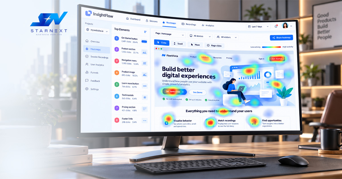
The common reason a page underperforms is that it answers the company's favourite questions rather than the visitor's immediate questions. A person searching for an emergency plumber needs availability, service area response expectations, credentials, a visible number and a fast route to request help. A long paragraph about company history above the contact option creates work at the possible moment.
A visitor comparing accounting firms needs something relevant industry experience, a transparent approach to fees, proof of capability and a sensible way to begin a conversation. The page should match the stage and stakes of the decision.
Make the first screen do useful work
- State relevance early: name the service, product, location or outcome in language to the reason the visitor arrived.
- Place proof near the decision: use reviews, case results, qualifications, client names where permitted or concrete demonstrations of the work.
- Offer one next step: visitors should not have to choose among five competing calls to action before they understand the page.
A dental practice for example can lead with the treatments whether it accepts new patients, the neighbourhood it serves and a clear appointment route. Brand personality still matters; it simply should not force a patient to search for practical information.
Trust is built in moments not added at the footer
People are cautious when a purchase is expensive, personal, unfamiliar or difficult to reverse. That is why a few generic trust badges near the footer rarely solve a credibility problem. Confidence comes from details appearing when the visitor needs them.
Show the people behind the work. Explain the process. Clarify what happens after a form is submitted. Give price context when exact pricing is impossible. Use customer proof that answers a concern instead of decorating the page with vague praise.
A home-renovation company can reduce hesitation by explaining how an estimate visit works, whether it is free, what information homeowners should prepare and when they can expect a response. That is more convincing than declaring itself "trusted."
Remove friction but do not remove useful qualification
Friction is any effort, uncertainty, delay or perceived risk that stops someone moving forward. Some friction is necessary. A financial adviser needs information to assess suitability; a B2B supplier may need company details before arranging a serious discussion. The aim is not to make every form as short as possible. The aim is to make every request feel reasonable.
If you ask for a phone number, explain why. If a quote process has stages, show progress and set expectations. If delivery costs vary, reveal the basis for them before the checkout screen. Visitors can accept effort when they understand the benefit and feel in control.
For e-commerce checkout deserves attention. Industry usability research consistently finds that a large share of carts are abandoned and checkout design can create friction. A one-page checkout is not automatically the answer; clarity, error handling, payment choice cost transparency and guest checkout are usually more important than the number of screens.
Test the business question, not the designer's preference
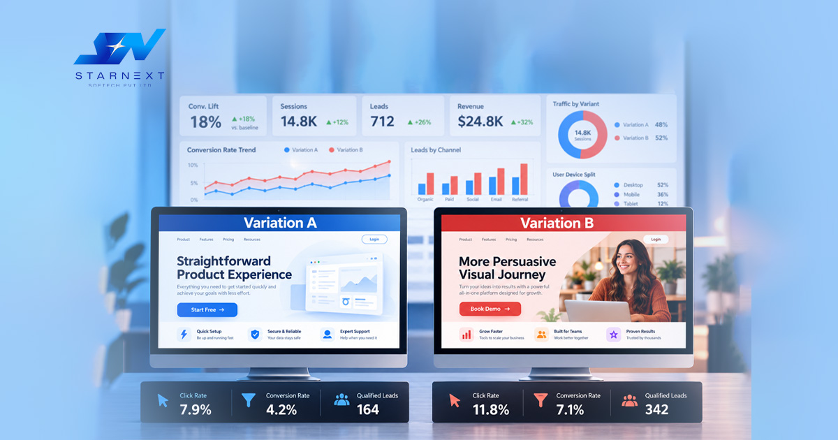
A/B testing is useful when it tests an idea against a business result. It becomes a show when teams do visual tests without fixing measurement, giving clarity or making sure the traffic is good.
Start with one business question. For example: are mobile visitors leaving because delivery costs come up late? Make a guess: putting a delivery estimate on the product page will increase purchases that are completed. Then pick one measure, completed orders, qualified leads or bookings and watch other related measures too.
Write down every test, including who the audience's page is, the guess, the date range, the result and the decision. A test that does not work is still helpful if it stops the team from making the mistake six months later.
Focus on maximize conversion value not just making more conversions
The phrase focus on making more value from conversions has a specific meaning in Google Ads: it means a way of bidding that is meant to improve the total value of conversions within a campaign budget. It relies on maximizing conversion value and good tracking.
The bigger business rule is just as important. Ten small-value inquiries are not always better than three that become customers. A good conversion plan tells the difference between a sales conversation and a casual question, tracks money from sales where needed and links good leads to later results when systems allow.
This helps marketing teams avoid working for the number of people who do something while sales teams have to deal with leads that are not right for the business. The best dashboard does not just show how many people converted; it shows whether those conversions helped the business grow in a way.
Common reasons websites get attention but not customers
- Sending every campaign to the homepage: a campaign for kitchen changes needs a page about renovations, not a general company page.
- Using words: visitors might search for "same-day air conditioner repair," not the name of a service plan.
- Not showing any price details: exact costs may need a quote. Showing ranges starting prices, payment options or price details helps reduce doubt.
- Treating mobile like a desktop: phone users need text that is easy to read, buttons that are easy to tap, fast calling and forms that do not need too much typing.
- Looking at the final click: content, branded search, email, reviews and retargeting can all affect a longer decision process.
- Changing everything at once: a new design, a new offer, a source of traffic and a new tracking setup make it hard to find out what caused any results.
The Practical Takeaway
A website that has traffic but no sales is not always failing at SEO. Paid ads. It may be getting the kind of visitors asking good visitors to work too hard or not giving enough confidence when a decision is needed.
The best work on conversion rate optimization starts with a question: what is stopping a good visitor from taking the next right step? Answer that question with data, evidence, from customers and careful tests. Then build a path that makes choosing your business feel clear, correct and worth it.