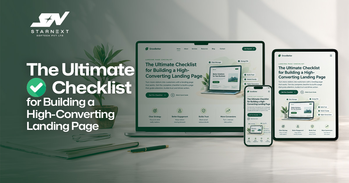
The Ultimate Checklist for Building a High-Converting Landing Page
We've all been there: You spend weeks designing a landing page. The typography looks sleek, the colors pop, the page loads in a split second, and you're convinced it's going to print leads. Then you launch it... and silence. People visit, scroll for three seconds, and disappear into the digital void without filling out a form, booking a call, or buying a thing. It's completely frustrating. Here is the truth: a high-converting landing page isn't an art project. It doesn't succeed because of fancy animations or clever wordplay. It succeeds because it follows fundamental human psychology. Whether you're launching a SaaS tool, selling an online course, setting up an e-commerce campaign, or trying to book high-ticket service clients, high-performing pages share a specific blueprint. If you're tired of playing guessing games with your traffic, here is the straightforward checklist you need to fix your conversion rate once and for all.
1. Lock In One Single Goal
The biggest mistake people make? Trying to do five things on one page. If your page asks someone to download a PDF, follow you on LinkedIn, schedule a discovery call, and watch a 20-minute video, you've lost them. When you give people too many options, they usually pick option zero: closing the tab. Before you touch a single line of code or open Figma, decide on the single action you want a visitor to take.
- Selling software? Focus entirely on the free trial or demo.
- Building an email list? Make the sign-up box the undisputed hero of the page.
- Selling a service? Drive every pixel toward booking that discovery call.
If an element doesn't actively help the user take that one specific step, delete it.
2. Write a Headline That Gets Straight to the Point
Your headline has about three seconds to do three things: grab attention, state what you offer, and explain why the reader should care. Too many brands try to sound "cool" or abstract. They write things like "Transforming the Future of Synergistic Workflow Dynamics." Nobody knows what that means. Instead, prioritize clarity over cleverness. Compare that corporate speak to this: "Create Professional Social Media Videos in Minutes - No Editing Experience Required."
Boom. Within two seconds, the reader knows what it is (video creator), who it's for (people who aren't professional editors), and the benefit (fast, high-quality results). Keep it simple, hit a real pain point, and tell them exactly what they get.
3. Make Your Value Proposition Drop-Dead Obvious
Once your headline hooks them, visitors immediately ask themselves a quiet question: "Why should I care about this instead of the dozen other options out there?" Your value proposition needs to answer that question clearly. You don't need a laundry list of 50 features. You just need to connect your solution directly to a problem they are dealing with right now.
- If your software saves someone 5 hours of manual data entry every week, state that upfront.
- If your coaching program helps founders scale without working 80-hour weeks, highlight that core outcome.
Position your value around relief and results, not just technical specifications.
4. Write Like a Human (And Focus on the Reader)
Most landing page copy fails because it suffers from a terminal case of "me-me-me" syndrome. Companies love talking about their shiny features and state-of-the-art tech. But your visitors don't actually care about your company - they care about their own problems. Shift your writing perspective from features to benefits. Instead of saying, "Our platform uses advanced AI visual processing algorithms," talk about how this technology solves your visitors' problems. Try: "Automate repetitive tasks, and get your team back hours of time each week." Use short sentences. Use conversational tones. Use bullet points. Break up long walls of text so the page can be scanned. If your draft sounds like a press release, scrap it and rewrite it like you're explaining your business to a friend at lunch.
5. Craft CTAs That Actually Feel Worth Clicking
"Submit" is not a call to action; it's a chore. "Click Here" tells the user nothing about what happens next. If you want better conversion rates, make your call-to-action (CTA) button promise a specific benefit. Give the reader a reason to want to click.
- Start My Free Trial
- Get My Free Quote
- Book My Strategy Call
- Grab the Free Guide
Visually, your CTA button should jump off the page. Use a high-contrast color that stands out from the rest of your palette, and place it naturally wherever a reader is most likely to make up their mind.
6. Keep Your Design Clean and Distraction-Free
Great design isn't about how much stuff you can fit on screen; it's about how much friction you can take away. Give your content some breathing room. The white space is generous, helping the eye, reducing cognitive overload, and making reading a breeze. Use a simple color palette, clean typography, and clear visual hierarchy. Ditch auto-play videos, floating pop-ups, fancy background animations, and massive navigation menus. Anything that pulls focus away from your primary goal is an obstacle to your conversion rate.
7. Stack Real Trust Signals
People are naturally skeptical when browsing the web. If you're asking for their email address, credit card, or business details, you have to prove you aren't full of hot air. Incorporate authentic trust elements throughout the page:
- Real customer reviews and detailed testimonials
- Recognizable client or press logos
- Simple metrics and mini case studies ("How we helped Client X boost revenue by 34%")
- Security badges, money-back guarantees, or industry certifications
Generic praise like "Great product!" doesn't move the needle much anymore. Use specific testimonials that detail a before-and-after transformation. Real details build real credibility.
8. Use Purposeful Visuals (No Cheesy Stock Photos)
Don't just post a stock photo of two smiling businesspeople shaking hands on your page to fill white space. Every visual element should reinforce your message. If you're selling software, include high-resolution screenshots or a short GIF of the interface in action. If you're selling a physical product or service, use real photos of the product in use or real results clients have achieved. A 60 second video demo can often get a complex value prop across faster than five paragraphs of text ever could.
9. Optimize for Mobile First, Not as an Afterthought
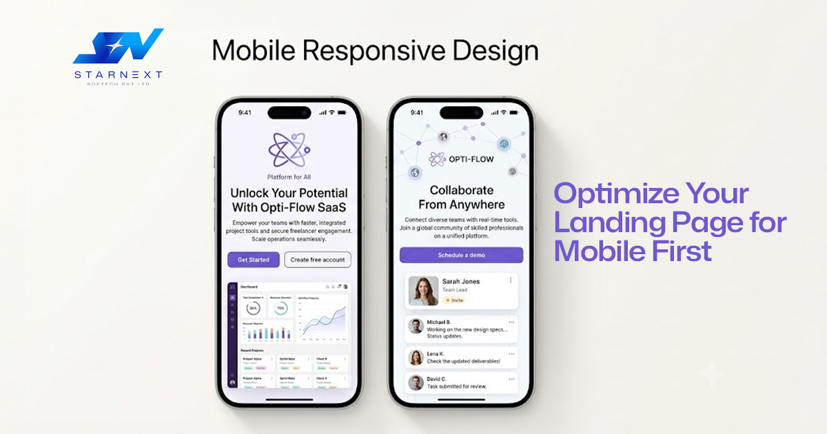
Over half of your web traffic is likely hitting your landing page from a smartphone. If your desktop design looks incredible but your mobile layout breaks, your conversion rate will plummet. Test your page manually on actual phones, not just through desktop browser inspect tools. Pay close attention to:
- Are font sizes legible without zooming in?
- Are buttons large enough to tap easily with a thumb?
- Do images shrink properly without breaking the layout?
- Does the page load fast on a standard mobile connection?
If a user has to fight your mobile interface to sign up, they'll just leave.
10. Weave in SEO Naturally
If your landing page relies purely on paid ad campaigns, search engine optimization might take a back seat. But if you want to capture passive, intent-driven traffic from Google, your on-page SEO needs to be tight. Identify your primary keyword (e.g., high-converting landing page) and weave it naturally into key strategic areas:
- Page Title & H1 Tag
- Meta Title & Meta Description
- Section Subheadings (H2s)
- Body copy and image alt text
- Clean, descriptive URL paths
Avoid keyword stuffing at all costs. Search algorithms and actual human visitors can spot unnatural phrasing instantly. Write for people first, search engines second.
11. Cut Your Forms Down to the Essentials
Every single field you add to an opt-in form drops your conversion rate slightly lower. If all you truly need to follow up with a lead is their first name and email address, stop asking for their phone number, job title, company revenue, and mailing address upfront. Save the detailed qualification questions for later in the sales funnel. If you absolutely must collect extensive data, break the process up into a user-friendly, multi-step form rather than throwing an intimidating wall of 10 empty boxes at them all at once.
12. Speed Up Page Load Times
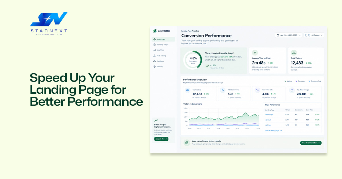
In the digital world, speed is life. If your landing page takes more than three seconds to load, a massive chunk of your paid or organic traffic will bounce before they ever see your headline. To keep performance lightning-fast:
- Compress every image (use WebP formats where possible)
- Minify CSS, JavaScript, and external tracking scripts
- Leverage browser caching and reliable CDN hosting
- Keep custom web fonts to a minimum
A fast-loading page directly lowers your bounce rates, improves user experience, and gives your ad quality scores a healthy boost.
13. Audit and Eliminate Conversion Friction
Before sending live traffic to your page, step back and do a full walkthrough as if you were a first-time visitor who has never heard of your brand. Ask yourself these honest questions:
- Is it immediately obvious what this business actually does?
- Is the pricing structure clear, or are key details hidden?
- Is the form easy to fill out on a phone?
- Do I feel safe putting my information into this site?
Common friction points include cluttered layouts, vague promises, hidden fees, and hidden contact details. Remove the friction, and conversions will follow naturally.
14. Track Data, Run Tests, and Iterate
A truly great landing page is never really "finished." Launching the page is just baseline step one; optimization happens over time through continuous testing. Set up basic analytics and track metrics like
- Overall Conversion Rate
- Form Completion Rates
- Bounce Rate & Scroll Depth
- Cost Per Acquisition (CPA)
Once you have a steady baseline of traffic, start A/B testing key variables. Test a new headline hypothesis, try a different main CTA, or swap out a static hero image for a video walk-through. Only test one variable at a time so you know exactly what caused the shift in performance.
The Pre-Launch Landing Page Checklist
Run through this quick sanity check right before you push your page live:
- One Main Goal: Does the page focus entirely on a single desired action?
- Clear Headline: Does it instantly communicate the core benefit within seconds?
- Strong Value Prop: Is it obvious why your offer is worth choosing?
- Reader-Centric Copy: Does the copy focus on customer benefits over company features?
- Action-Oriented CTA: Is the call-to-action high-contrast, clear, and compelling?
- Clean Layout: Is the design clutter-free with plenty of breathing room?
- Trust Signals: Are reviews, logos, or guarantees clearly visible?
- Relevant Visuals: Do images and graphics actively support the offer?
- Mobile-Optimized: Is the page smooth and effortless to use on mobile devices?
- Natural SEO: Are relevant search terms integrated smoothly into the content?
- Minimal Forms: Are form fields stripped down strictly to essential information?
- Fast Speed: Does the page load quickly on standard connections?
- Friction-Free: Have potential doubts, confusion, or extra choices been cleared away?
- Tracking Ready: Are analytics tags and conversion goals active?
- Testing Strategy: Is there a clear plan to test and optimize performance over time?
Final Thoughts
At the end of the day, a high-converting landing page isn't about showing off your flashy web design skills. It's about getting the right message to the right person at the right time and then removing obstacles. The focus should be on understanding the actual friction points of your audience. And show them how your solution is going to solve their problem clearly. Back up your claims with real proof. And make it as painless as humanly possible to take action. Get those core principles right, keep testing your results, and the conversion numbers will take care of themselves.