The Role of UI/UX Design in Reducing Website Bounce Rates

If your site is getting plenty of traffic but almost nobody is sticking around, take a breath. You don't have a marketing problem - you have a user experience problem. Few things are more frustrating than watching your analytics report a climbing bounce rate. You spend weeks running SEO campaigns, tweaking paid ads, and posting on social media, only for visitors to land on your page and vanish five seconds later. No clicks, no reads, no form fills. Why do people leave so fast? Usually, it comes down to one simple thing: the site didn't give them an easy, comfortable reason to stay. That is where UI/UX design comes in. You can write the best copy on the web and rank #1 on Google, but if your site feels confusing, slow, or cluttered, people will hit the back button. Good design fixes that leakage by making the entire visit feel effortless.
What UI and UX Actually Mean (Without the Buzzwords)
People often throw 'UI' and 'UX' together like they’re the same thing, but they handle two very different parts of the experience.
- UI (User Interface): This is everything you visually see and click on. Think page layouts, color palettes, fonts, buttons, forms, and icons. A good UI isn't just about making things look sleek; it's about making the screen visually clear so your eyes know where to look first.
- UX (User Experience): This is how the site actually feels to use. Can visitors find what they came for without getting annoyed? Is the site easy to navigate? Does completing a task feel smooth or clunky?
Look at it this way: UI is the aesthetic and the layout, while UX is the journey and the feeling. When both work together, visitors stick around.
Understanding Bounce Rates (And When to Worry)
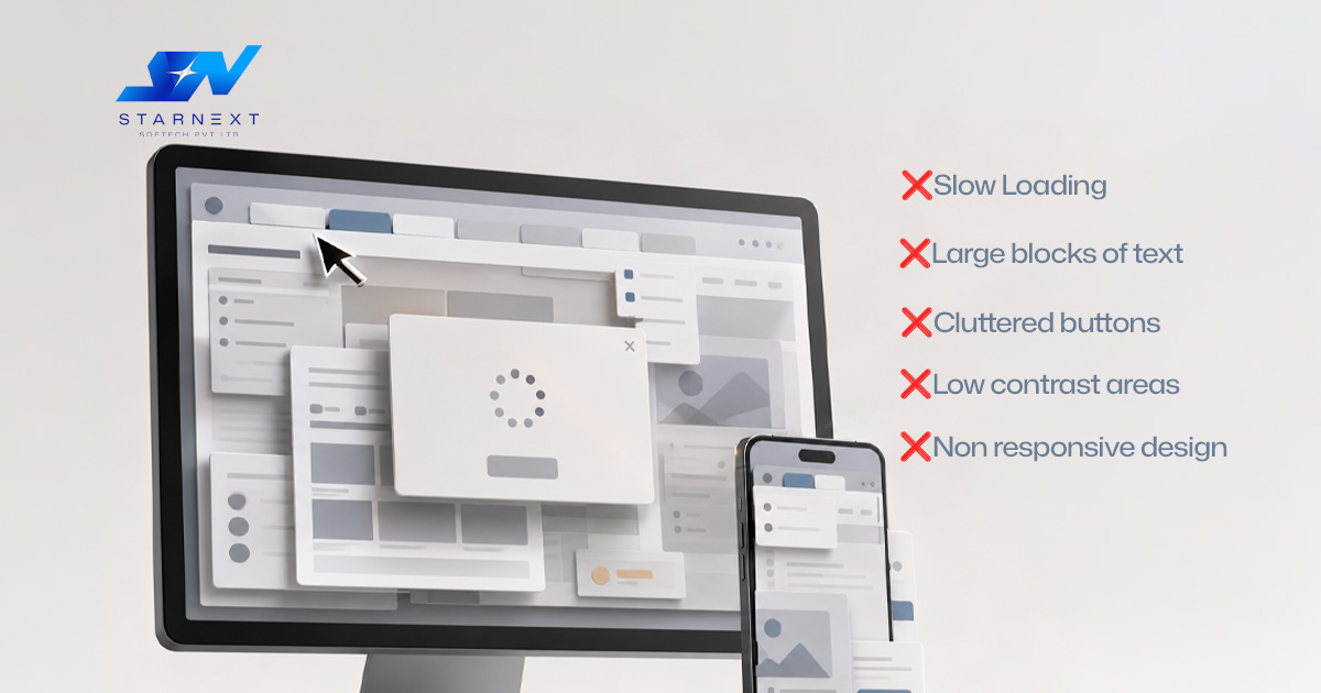
A bounce is when someone visits a page on your site and then leaves without clicking through to any other page. Now, a bounce isn't necessarily a bad thing. If a user lands on a blog post, reads the quick answer to their question, and leaves feeling satisfied, that’s a win. They got what they needed. The real problem starts when people bounce off high-value pages - like your homepage, service offerings, or product landing pages. That usually means your site threw up a roadblock. The most common bounce-rate triggers include:
- Confusing or hidden navigation menus
- Pages that take forever to load
- Layouts that break or look awful on mobile phones
- Wall-of-text paragraphs that look exhausting to read
- Weak, confusing, or invisible call-to-action (CTA) buttons
- Aggressive pop-ups blocking the screen immediately
- Designs that look like they haven't been updated since 2010
- Long, tedious contact forms asking for too much info
Notice what all of those have in common? They are 100% design and experience issues.
6 Ways UI/UX Keeps People on Your Site
1. Building Instant Trust
Visitors judge your business in milliseconds. Your site looks old and cluttered; people will naturally question your credibility. A clean, professional layout is the equivalent of a warm digital handshake. It tells the user, 'You're in the right place, and we know what we're doing.'
2. Making Navigation Brain-Dead Simple
Nothing causes a faster bounce than forcing a user to hunt for basic information. Great UX structures pages logically so people don't have to think. For a service business, a clean, natural path looks like this:'
Home → Services → Specific Service → Case Study → Contact
When the next step is obvious, people naturally keep clicking.
3. Making Content Easy to Skim
No one reads websites word-for-word anymore; they scan. If a visitor lands on a massive block of unbroken text, they will leave. Generous spacing, bold highlights, concise bullet points and clear subheadings break up heavy content so that readers can instantly pull out key points.'
4. Designing for Phones First
More than half of your visitors are browsing on a smartphone. If your mobile layout forces people to pinch-to-zoom, scroll horizontally, or struggle to tap tiny buttons, they will jump back to Search instantly. Responsive UI means text is readable and buttons are thumb-friendly on any screen size.
5. Guiding Users to the Next Step
A great user experience never leaves someone hanging at a dead end in the digital world. Clear call-to-action buttons like “Get a Quote” or “Book a Demo” provide clear direction to users. Keep them prominent, keep the copy simple, and put them where people look naturally.
6. Removing Unnecessary Friction
Friction is anything that makes a user work harder than they should. If someone wants to ask a simple question, don't ask for their home address, job title, and phone number on the contact form. Strip away unnecessary fields, speed up load times, and make taking action as painless as possible.
What a UI/UX Designer Actually Does
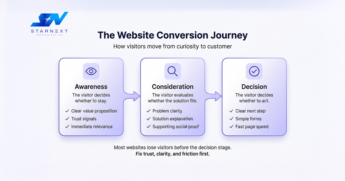
Fixing a website isn't just about changing colors or swapping fonts. A solid designer looks at the psychology behind how people use the web:
- User Research: Analyzing heatmaps and session recordings to see where real people get confused or stop scrolling.
- Wireframing: Sketching out basic layouts to nail down the user journey before touching any visual elements.
- Interaction Design: Crafting menus, forms, and buttons that respond predictably when clicked or tapped.
- Usability Testing: Putting the site in front of actual users to fix friction points based on real data, not guesswork.
How UI/UX, SEO, and Sales Work Together
Think of SEO as the marquee sign that draws people into your store. UX is the layout of the store that makes it easy to browse, and conversion optimization is the friendly checkout counter. If you spend thousands on SEO to rank #1 But sending that traffic to an ugly, slow, or confusing page, you're wasting your budget. Even worse, if search engines see hundreds of visitors landing on your page and immediately bouncing back to the search results, it signals that your page didn't give them a good experience - which can drag down your search rankings over time.
Quick UX Audit: Where to Start Today
Want to know why people might be bouncing off your site right now? Pull up your homepage on your phone and ask yourself these brutally honest questions:
- Can I tell what this business actually does within 3 seconds?
- Is the main navigation menu easy to open and tap?
- Does the page load in under two seconds?
- Are the text blocks short and easy to skim?
- Is the main call-to-action button obvious?
If you answered 'no' to any of those, start there. Often, making small fixes - simplifying a contact form, making a menu clearer, or breaking up long paragraphs - can dramatically lower your bounce rates and keep visitors engaged.
Final Thoughts
Traffic is only half the battle. What happens after someone clicks on your link matters just as much as getting them there. Good UI/UX design isn't a luxury or a cosmetic detail you worry about at the end of a project. It is the core foundation of a website that actually converts. When you respect your visitor's time, make information easy to find, and remove friction, keeping people on your site becomes second nature.